
Setup Guide Redesign
How an onboarding redesign lifted user activation and doubled upgrade rate.
Company
Checkfront
Methods
User interviews, competitive analysis, wireframing, A/B testing
Year
2022 - 2023
Timeline
5 months

IMPACT AT A GLANCE
Activation rate up 7%
First-time operators reaching activation rose from 20.1% to 27.4%.
Upgrade rate nearly 2X
Upgrade rate climbed from 7.4% to 14% in the A/B test.
Shipped to all users
The new setup guide launched to everyone in March 2023.
OVERVIEW
An onboarding guide new operators were ignoring
Checkfront offers a flexible online booking system with a wide range of features to help operators manage their complex operations.
The setup guide is our in-app onboarding experience, built to help first-time operators navigate the platform and explore its core features.
Pendo analytics showed very low engagement with the setup guide during the 21-day trial. That gap kicked off a growth initiative to rethink the onboarding experience.

Old setup guide and Pendo stats
The problems
My assumption was that the guide failed to help new operators learn and evaluate Checkfront's core value for two reasons.
#1
Unclear task dependency
There was no visual cue that Step 1 had to be completed before Step 2 became available, so operators got stuck without knowing why.
#2
Low-value administrative tasks
Steps 3 and 4, company details and tax setup, delivered no immediate value and could have been done at any time, yet they sat in the critical path.
The goals
The bet: if we get operators to their aha moments faster, they will experience the product's value and be more likely to pay.
Increase activation rate
Help first-time operators complete the tasks that lead to aha moments, so they feel the value quickly.
Success metrics
Higher completion rate per task
Higher completion of the entire guide.
Increase upgrade rate
After multiple aha moments, operators are more likely to keep using the product and upgrade to a paid plan.
Success metrics
Higher trial-to-paid conversion.
DISCOVERY
Learning what operators actually wanted
I started with interviews with first-time operators to understand the outcomes they were after.
The target was at least five new operators who had used Checkfront for 7 days, recent enough that the first-time experience was still fresh.
The recruitment wall and my solution
The challenge
I emailed 31 qualified operators. NONE accepted. Two likely reasons:
New users weren't comfortable sharing feedback, feeling they hadn't used the product enough to say anything useful.
A 30-minute interview with no compensation had little appeal, since the team had no incentive budget at the time.
Halfway through the sprint, I had zero interviews booked.
The fix: widen the pool
I broadened the criteria to include users across the full 21-day trial, which grew the pool from 31 to 105 candidates and sharply raised my odds of booking sessions.
By the end of the sprint, I hit the goal with 7 interviews booked.
7-day trial
21-day trial
31 users
0 participant
105 users
7 participant
INSIGHTS
What operators told me
Each operator described their first-time experience and the outcome they wanted, which mapped cleanly onto our core features.
They wanted to test how flexible the product setup was
The Product Builder had to come first, so operators could see the configuration handle their real setup early.
"Checkfront's product inventory management is more flexible than Shopify's."
They judged the tool by the customer booking experience
The customer booking page helped them see how their customers would book their product online.
"I found out about Checkfront when I booked a hotel room, and it was easy to make a booking."
They cared about reliable customer communication
Email notifications were essential to their business operations and building strong customer relationship.
"We want to make sure we can quickly let our customers know when there are changes in their bookings."
They ran their day out of the booking calendar
Calendar management was central to daily operations, so the guide had to help operators feel confident there.
"We check our calendar every morning for new bookings and update bookings on customer requests."
Turning customer needs into a structure
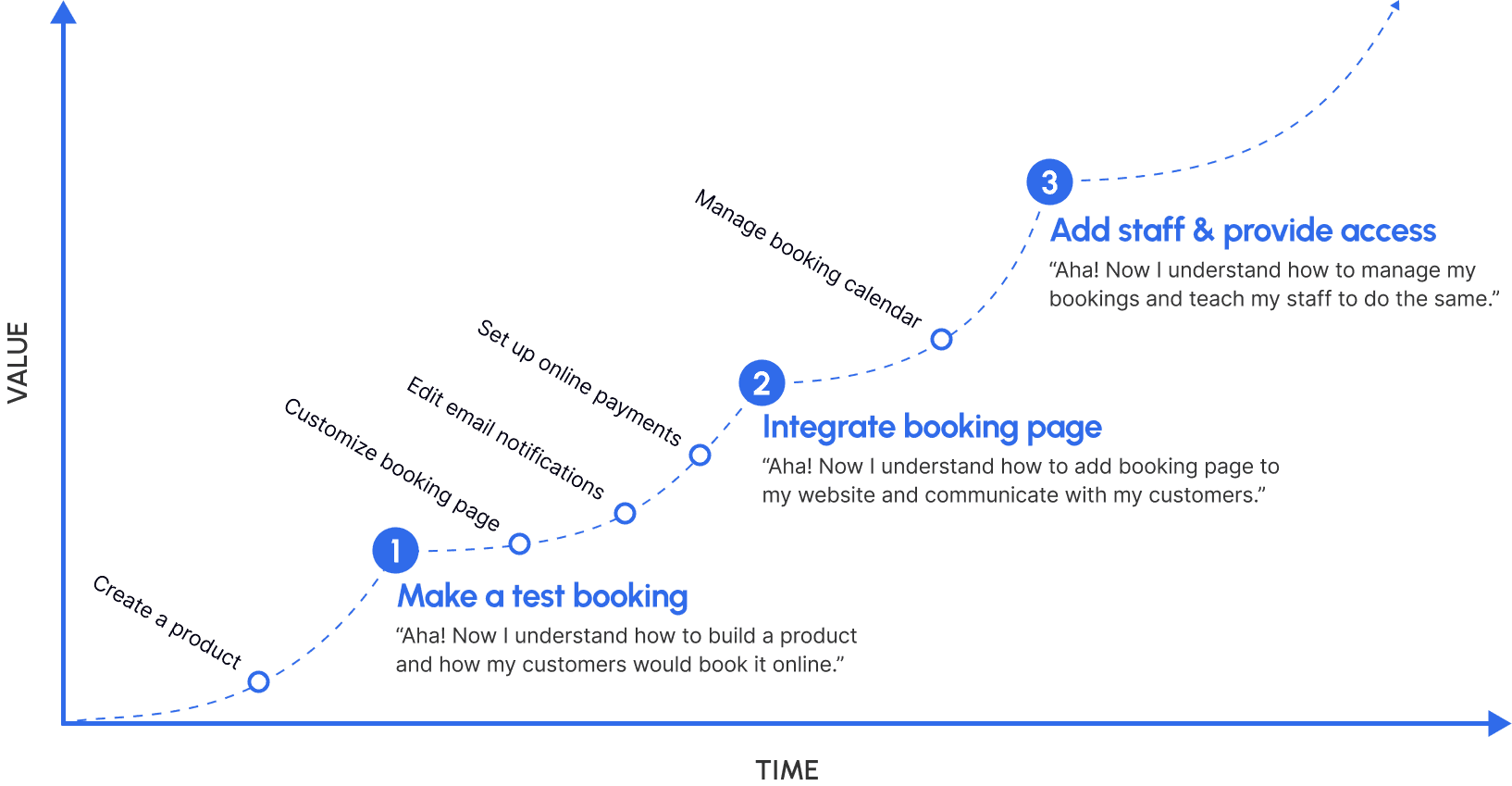
I revisited the core product experience and shaped the onboarding journey into three steps: Create, Sell, and Manage.
I mapped the tasks operators cared about onto each step, added a few to encourage exploration, and ordered them to follow a natural flow that supports step-by-step completion.
Step 1: Create a product
Create a product
Make a test booking
Step 2: Sell product online
Customize booking page
Edit email notifications
Set up online payments
Integrate booking page
Step 3: Manage bookings
Manage booking calendar
Add staff and provide access
We made sure the final task in each step was likely to trigger an aha moment, creating several activation opportunities across the journey rather than one.
COMPETITIVE ANALYSIS
Borrowing what already works
I signed up for Productboard, Calendly, and QuickBooks to study their onboarding, looking for best practices, patterns, and intuitive learning flows. Key takeaways:



IDEATION
From many variations to one direction
I created multiple wireframe variations for the new guide, pulling in the research findings and the competitive best practices.

6 different approaches for the new setup guide
Internal team feedback
Three considerations surfaced from our internal reviews:
High effort for tutorial videos
The support team was stretched thin on enterprise support and had little capacity to record or edit videos.
An existing floating-button initiative
A separate plan already aimed to give users quick access to the knowledge base via a floating button.
Poor UX with modals
Modals added clicks and made tasks feel disconnected. With only a few steps, a fullscreen modal was unnecessary.
The decision
I made a decision to go with variation #6, which was integrating the setup guide directly into the dashboard to improve visibility and reduce friction.
The dashboard had the highest traffic, making it the ideal place for the guide. Once users completed the steps, they could choose to dismiss it.
The choosen direction delivered three things:
Collapsible accordion to expand or hide the full guide in one click.
Clear task dependency through disabled states and tooltips.
Organized tasks and steps using tab and card components for scannability.


Finalizing wireframe #6 with clear dependancy
DELIVERING
The redesigned setup guide
For the final iteration, I worked closely with the team on copy, technical constraints, and UI polish.
Clearer copy: removed duplicated labels and shifted to a more approachable, conversational tone.
Colourful illustrations: added visual interest to capture attention and guide the eye.


New improvements over old setup guide
Tasks organized around core features
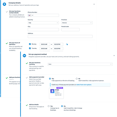
Before
The guide missed high-value tasks that showcase what the product can do.

After
Tasks were grouped into Create, Sell, and Manage to communicate value clearly.
Responsive on mobile
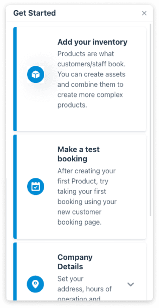
Before
Layout issues forced excessive scrolling.
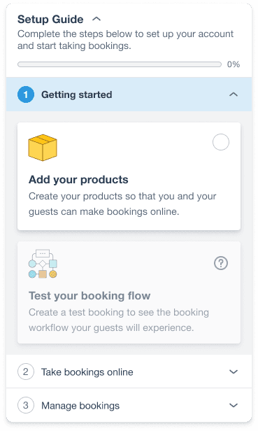
After
A fully responsive layout with progressive content display.
Progress bar and checklist
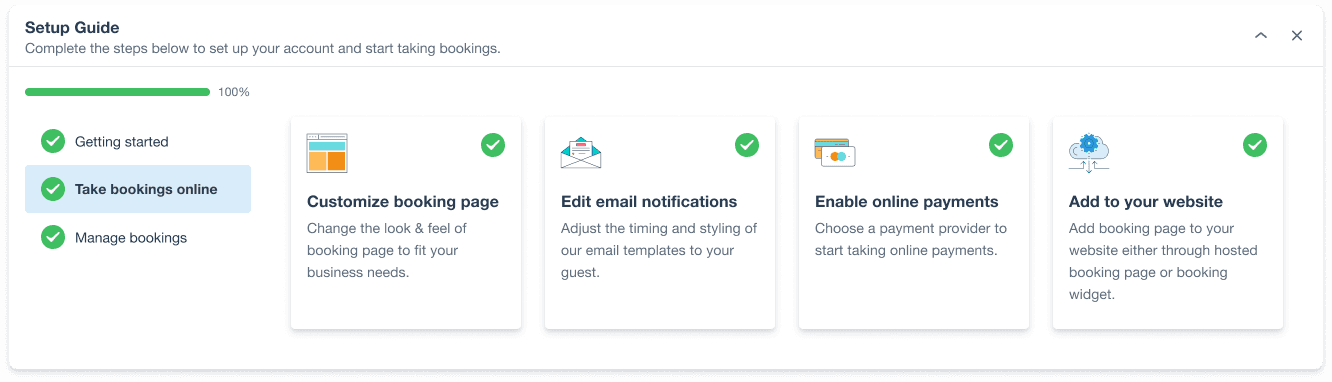
These motivated operators by showing progress and giving a sense of accomplishment as they completed tasks.
Handing off without surprises
To keep implementation smooth, I documented the guide in detail in Figma: tab states, collapsed versus expanded accordion behaviour, mobile interactions, component variants, and more.
The documentation let developers build the guide accurately and avoided last-minute surprises during development.
IMPLEMENTATION
Testing it against the old guide
With our Data Analyst, we ran an A/B test over three months, from December 2022 to February 2023. Half of new trial users saw the new setup guide, half saw the existing one.
Goals: confirm any lift in task and full-guide completion, and understand how task completion related to trial-to-paid conversion.
Step 1: Getting started
A minimal lift, as expected. Step 1 in the new guide covered the same ground as Steps 1 and 2 in the old one.

Zero task taken
Task 1: Create a product
Task 2: Create a test booking
Entire step 1
Step 2: Take bookings online
This step drove the biggest wins.
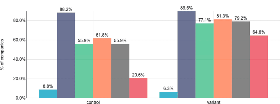
Zero task taken
Task 1: Customize booking page
Task 2: Edit email notifications
Task 3: Enable online payments
Task 4: Booking page integration
Entire step 2
Step 3: Manage bookings
Smaller lifts in managing the calendar and adding staff. Less dramatic than Step 2, but a positive signal with room to improve.
Review bookings: +2.8%
Add staff: +9.3%
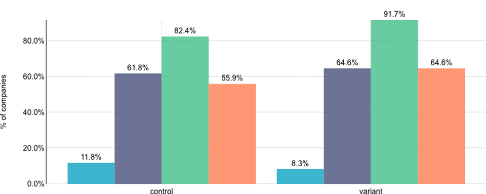
Zero task taken
Task 1: Review bookings
Task 2: Add staff
Entire step 3
Business impact
Activation rose from 20.1% to 27.4%, and upgrade rate nearly doubled from 7.4% to 14%. These confirmed that the new guide helped first-time operators recognize Checkfront's value and moved them to upgrade.

Activation rate

Upgrade rate
+7.3%
Activation rate
X2
Upgrade rate
Following the result, the new setup guide launched to all users in March 2023.
TAKEAWAY
What I learned
Be resourceful under constraints
Recruiting first-time users with no incentive budget was hard. Widening the pool and adapting the criteria got me from zero interviews to a full slate.
Let quantitative insight guide the qualitative
Pendo flagged the problem in the first place. Next time I would lean on analytics earlier to focus and direct the interviews.
Advocate for research
I would share metric-driven results in company-wide meetings and Slack to build design culture and support for future research.
What's next
I plan to work with Marketing and Product on a holistic customer journey, from discovery to advocacy.
I am especially drawn to the growth space, where product, experimentation, marketing, and data meet, and where design contributes directly to both business outcomes and user experience.
Next project
