Role
Product Designer
Team
Product Manager, Developers, Data Analyst
Timeline
5 months


Overview
The setup guide failed to help new operators learn and evaluate Checkfront's core value.
1
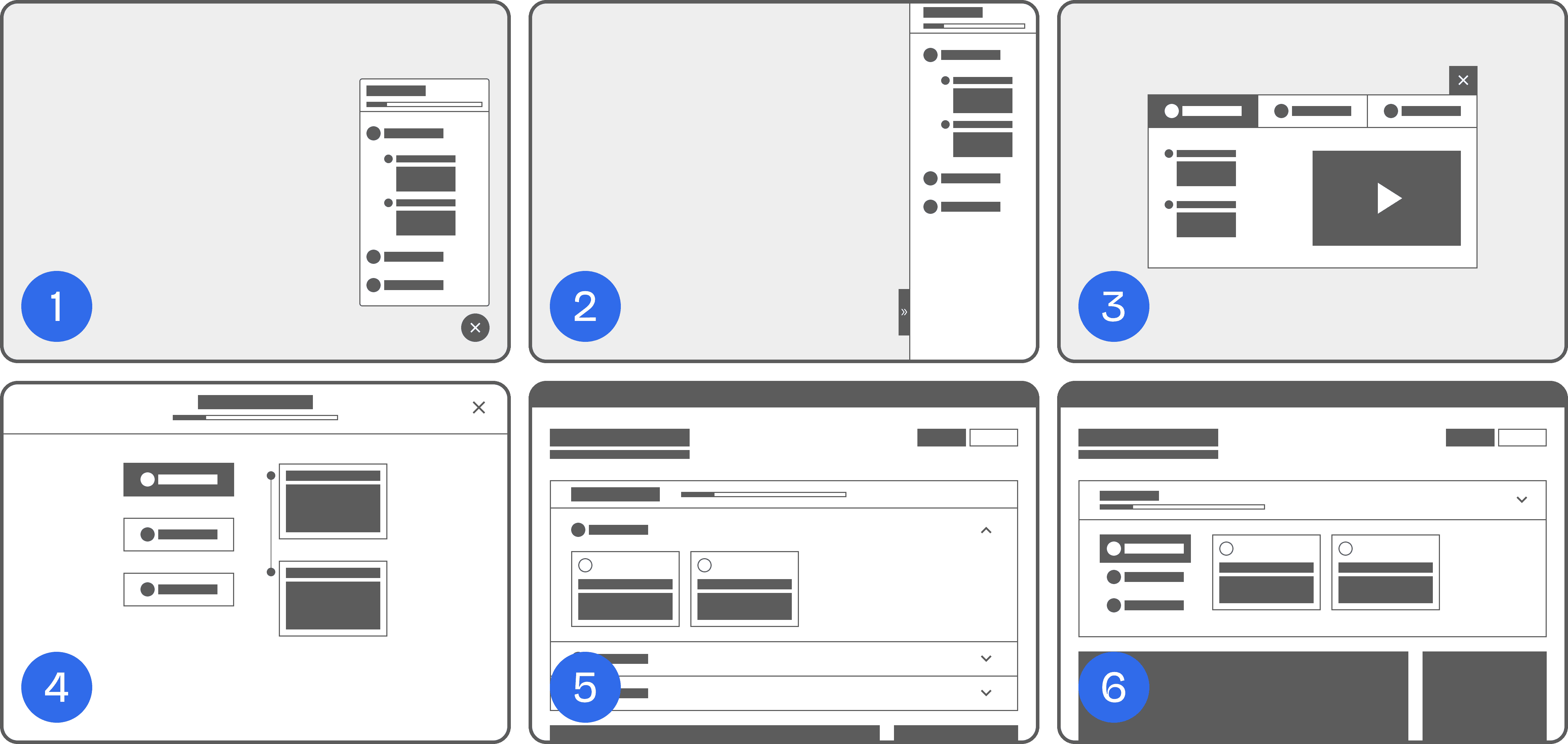
Unclear task dependancy.
There was no visual cue to indicate that Step 1 needed to be completed before Step 2 became available.
2
Low-value administrative tasks.
Steps 3 and 4 (company details and tax setup) did not provide immediate value and could be completed at a later time.
Increase activation rate
By helping first-time operators complete tasks that lead to their aha moments, they can quickly experience the value of our product.
Success goals
Increase the completion rate of each task.
Increase the completion rate of the entire setup guide.
Increase upgrade rate
After experiencing multiple aha moments, first-time operators will be more likely to continue using our product and upgrade to a paid plan.
Success goal
Increase the Trial-to-Paid conversion rate.
Discovery
I began by conducting interviews with first-time operators to deeply understand their desired outcomes.
Our target was to recruit at least five new operators who had been using Checkfront for 7 days. This short timeframe ensured that their first-time experience was still fresh in their minds.


The challenge
I sent email invitations to 31 qualified operators, but none accepted. This may have been due to:
New users were not comfortable sharing their experience. New users may have felt they hadn’t used the product enough to offer valuable feedback.
A 30-minute interview without a monetary reward didn’t appeal to participants. Our product team had no budget for compensation at the moment.
As a result, we had no interview bookings during the first half of our sprint.
The solution
Expanding the research pool
We broadened our participant criteria to include users who had been using Checkfront for the full 21-day trial period. This increased our pool to 105 candidates, significantly raising the chances of securing interviews.
By the end of the first sprint, we reached our goal with 7 interviews booked.
Findings
Here was what participants shared about their first-time experience with Checkfront, along with their desired outcomes mapped to our core product features:
Product builder
They wanted to evaluate how our flexible product configuration could meet their needs.
Customer booking page
They were interested in evaluating how customers would book their products online.
Email notifications
They wanted to assess the effectiveness of email notifications for customer communication.
Booking calendar
They wanted to evaluate how well they could manage bookings using our calendar.
Aligning product features with user needs
My team and I revisited our core product experience and identified 3 main steps in the onboarding journey: Create, Sell, and Manage.
We mapped key tasks to each step that aligned with user goals and added a few more to encourage exploration of other valuable features. Tasks were intentionally ordered to follow a natural, logical flow and support step-by-step completion.
We ensured that the final task in each step was likely to trigger an aha moment, increasing the chances of product activation at multiple points during the onboarding experience.

I conducted a competitive analysis by signing up for Productboard, Calendly, and QuickBooks to review their onboarding experiences.
My goal was to identify best practices, patterns, and intuitive learning flows from these popular SaaS tools. Key takeaways included:

Wizard / Tabs
Organize steps in a logical, easy-to-follow order.
Progress bar
Helps users track progress and stay motivated.
Checklists
Reinforce satisfaction when tasks are completed.
Floating button
Offers quick access to the setup guide.
Ideation
I created multiple wireframe variations for the updated setup guide, incorporating insights from user research and best practices from the competitive analysis.
Internal team feedback
Several considerations emerged from internal reviews:
High effort for tutorial videos
Our support team was already overwhelmed with enterprise customer support and had limited capacity to record or edit tutorial videos.
Existing initiative for floating button access to the knowledge base
There was an ongoing plan to allow users to quickly access help content via a floating button, aimed at reducing support tickets and improving self-serve learning.
Poor UX with modal UI
Although modals could be reopened, they introduced extra clicks and made tasks feel disconnected. Since the setup guide had relatively few steps, a fullscreen modal was unnecessary.
Final decision
We decided to integrate the setup guide directly into the dashboard to improve visibility and reduce friction. The dashboard had high traffic, making it the ideal place for the guide. Once users completed the steps, they could choose to dismiss it.
Here was the updated high-fidelity wireframe for the variation #6.

Collapsible accordion
Enabled users to expand or hide the entire setup guide in a single click.
Clear task dependency
Disabled states and tooltips communicated the order of steps effectively.
Organized tasks & steps
Tab and card UI components improved the scannability and flow of the guide.
Delivering
For the final iteration, I collaborated closely with my team to gather feedback on copy, technical constraints, and overall UI improvements.

Key improvements
Clearer copy
Replaced duplicated labels and used a more approachable conversational tone.
Colorful illustrations
Visually appealing illustrations helped capture user attention.
Here were the new improvements over the old setup guide.
Organize high-value tasks around core features

Before
Missing high-value tasks that showcase product capabilities.

After
Tasks organized around 3 core steps—Create, Sell, and Manage—to better communicate product value.
Responsive layout on mobile

Before
Layout issues caused excessive scrolling.

After
Fully responsive layout with progressive content display.
Drive task completion with progress bar and checklist

Progress bar and checklists motivated users by showing progress and offering a sense of accomplishment.
To ensure smooth implementation, I created detailed documentation in Figma, including tab states, collapsed vs. expanded accordion behavior, mobile-specific interactions, component variants and more.
This documentation helped developers build the setup guide accurately and avoided last-minute surprises during development.
Implementation
With support from our Data Analyst, we ran an A/B test over 3 months (Dec 2022 – Feb 2023). 50% of new trial users were exposed to the new setup guide, while the other 50% saw the existing version.
Goals
Verify any increase in the completion rate of each task and the entire setup guide.
Understand the correlation between task completion and trial-to-paid conversion.
Task completion rate
Step 1: Getting started

There was a very minimal increase in the completion rate of this step. This was to be expected as Step 1 in the new setup guide consisted of 2 tasks (i.e. create a product, and make a test booking) that were similar to Step 1 & 2 in the current setup guide.
Step 2: Take bookings online

This step revealed the most promising improvements.
The completion rate of editing email notifications, which was directly aligned with user's desired outcome, increased by 21.2%. This validated our assumption about user desire for reliable communication features.
Unexpectedly, the biggest winner was integrating booking page into operator's website with the whopping 23.3% increase in completion rate. This showed high interest in embedding booking functionality into websites.

Payment method setup task - Current setup guide
Setting up payment methods also surprisingly went up to 19.5% considering that it was included in the current setup guide.
The main difference was that this task on our current setup guide only showed our provider partner Stripe and a tiny text link to check other payment providers.
The new setup guide redirected users straight to our integration page that listed all available payment providers. Sometimes, showing more options might prove better transparency.
One interesting stat was the decrease in no action taken (i.e. zero steps) with the new setup guide by 2.5%. This could indicate that bite-sized tasks helped reduce user friction at the start.
Step 3: Manage bookings

There were small increases in the completion rate of managing booking via calendar and adding staff accounts. Although the change wasn't as significant as Step 2, this was a positive signal with room for further improvements.
Here was the table with the overall task completion rate.
Activation rates rose from 20.1% in the control group to 27.4% in the variant group, and upgrade rates nearly doubled from 7.4% to 14%. These results confirmed that the new setup guide helped first-time users recognize Checkfront’s value and encouraged upgrades.
Activation rate

Upgrade rate

Following this success, the new Setup Guide officially launched to all users in March 2023.
Takeaway
What I learned
Being resourceful
Recruiting first-time users without an incentive budget was challenging. Despite that, I learned to be resourceful by expanding the participant pool and adapting research criteria.
Leveraging quantitative insights
In the future, I’d use analytics from tools such as Pendo to track user behaviour in our platform to support or guide my qualitative research.
Advocating UX research
I'd start sharing metric-driven results to our company-wide meetings and Slack channels to help foster design culture and build support for future research investments.
What's next
Looking ahead, I plan to collaborate with the Marketing and Product teams to design a holistic customer journey, from discovery to advocacy.
I'm especially excited about opportunities in the growth space, where product, experimentation, marketing, and data intersect. It's an area where design directly contributes to both business outcomes and user experience, and I’m eager to continue learning and making an impact.